The new MOUZ
For the first time ever, we will change the look and feel of our brand, including a new, iconic logo. Shortly after the establishment in March 2002, MOUZ fielded the same logo for nearly two decades. Over 360 tournaments have been won with the logo, that many gaming fans around the world recognize, but are unable to define what they really see in it.
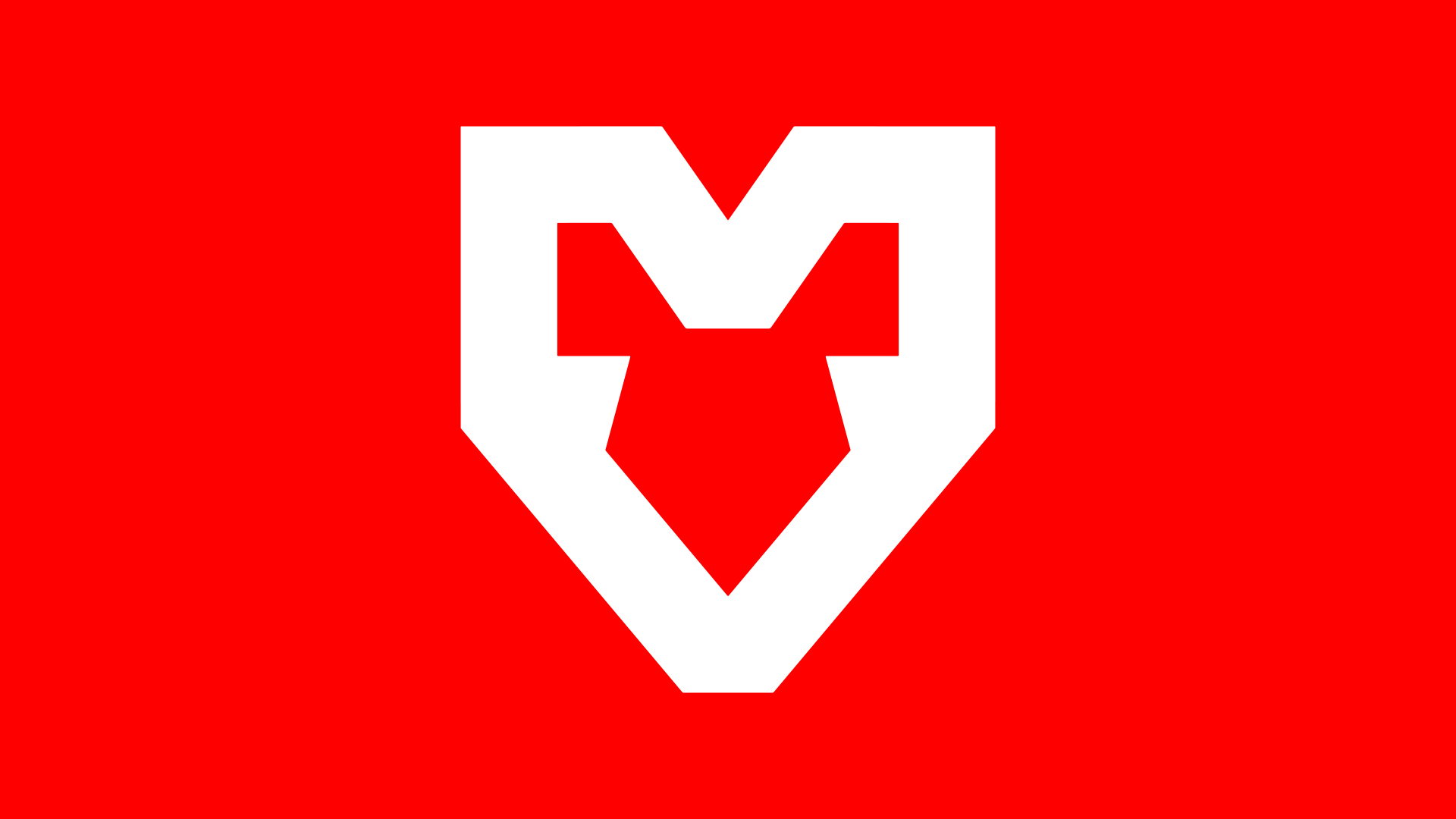
Initially, the historic MOUZ logo mimics the head of a mouse, while it also represents the palm of a player touching a gaming mouse. This lore faded over the course of many years, so newer fans wouldn’t even know. Our new logo is back to the roots, as the very first logo that identified MOUZ in 2002 for a few months was simple, yet effective: °o°
You are currently viewing a placeholder content from Default. To access the actual content, click the button below. Please note that doing so will share data with third-party providers.
More InformationOur new badge logo will be the core part of our new identity. A powerful logo that unfolds its potential when you see it in a lot of different occasions: from content to merchandise, throughout every digital display all up to the screens of the biggest arenas. With our new logo comes a whole new visual identity for MOUZ. Headlined by the iconic red color that represented the brand since 2002, we expect to create unique content pieces that will be widely recognizable as MOUZ.
One of our biggest difficulties in the process of modernizing a well-established logo was our intention to live up to the rich history of MOUZ, one of the true originals in the professional gaming industry. Learn more about the process of developing a new identity for one of the most popular gaming teams in our background story.
You are currently viewing a placeholder content from Default. To access the actual content, click the button below. Please note that doing so will share data with third-party providers.
More InformationOur new logo is directed at all our fans – we see you and we hear you. Fans can expect a new face of MOUZ, with more content, tailored towards what the fans want to see, as well as a premium merchandise collection launching soon.